
Rockmelt
ROCKMELT
APP
A social browser that surfaces content you
care about.
ROLE
Visual Designer
DELIVERABLES
Responsive Website
Identity
Print
Emails/blog
Shirts
CHALLENGE
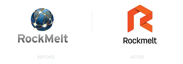
Rockmelt was redefining how people browsed the web. Long gone are the days of navigating through URL bars, and instead automatically getting the content you like from sources you enjoy reading or viewing. In order to represent that, it needed a rebrand from it's current apocalyptic themed logo to a more fresh and modern approach. The task was given to me after a meeting with the CEO about my initial idea sketches of the logo.
APPROACH
Since it was going for a full rebrand, we wanted to go far away from the dystopian world icon and give the new logo life and vibrance. The obvious route was to create a logo that resembled the brand name but Rockmelt was more than those two words, it was the new way of browsing content on the internet. We were inspired by the collective content of the world wide web and how we envisioned it move. We landed in a mark that represents motion because the web wasn't static, its constantly moving and changing.
color pallette
The colors of the internet was a place of inspiration, we wanted to capture a blend of Rockmelt's personality and the world wide web. The palette was designed to give more life to the content and was able to be flexible with any given content.

